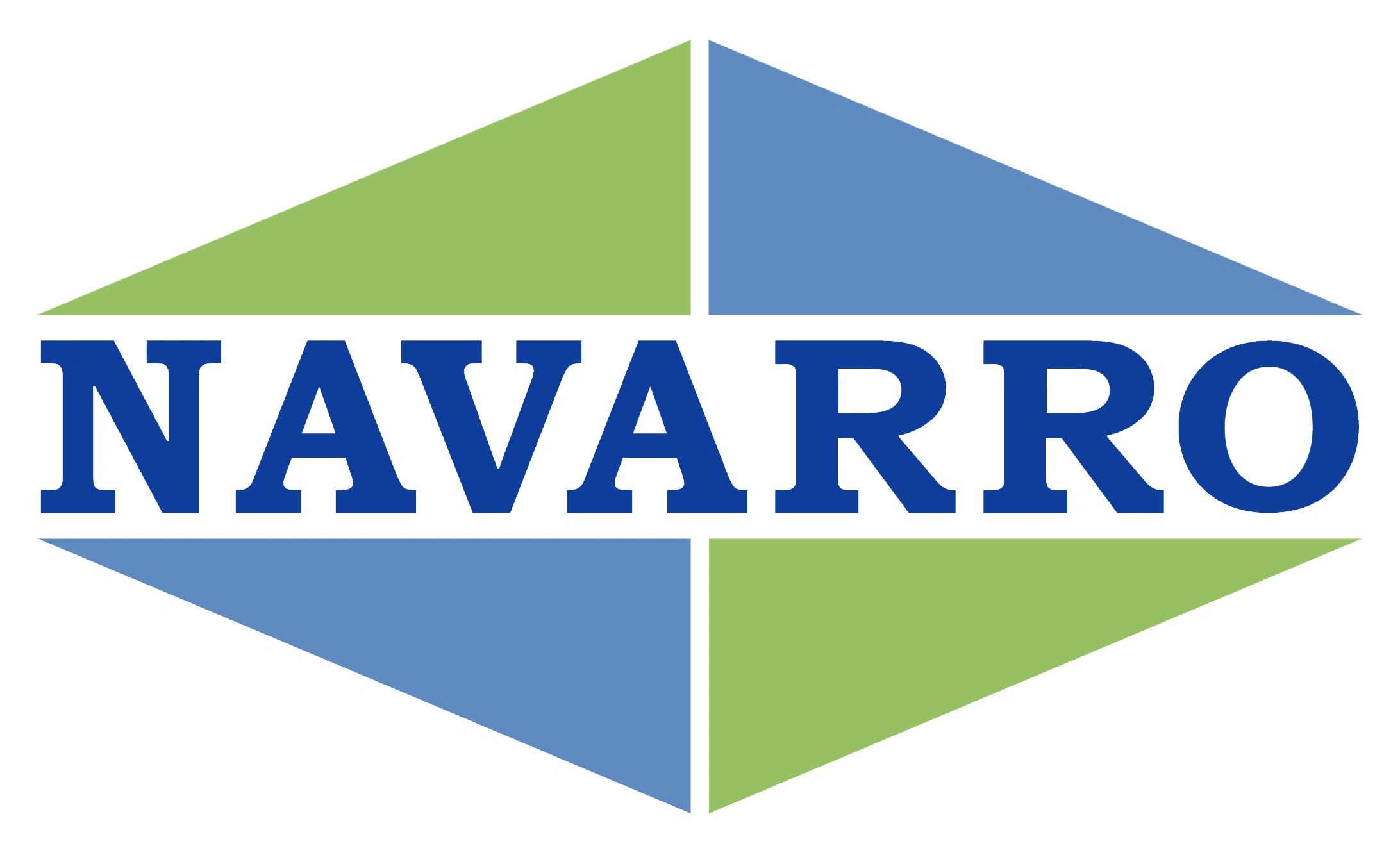
If you’ve visited navarro-inc.com recently, you may have noticed a brand-new look. Our new and improved website features a clean design, streamlined layout, and more information about the exciting work we are doing on behalf of clients across the country. That’s not all that’s changed, though. We’ve also updated our logo to make it just as bold and bright as Navarro’s future.
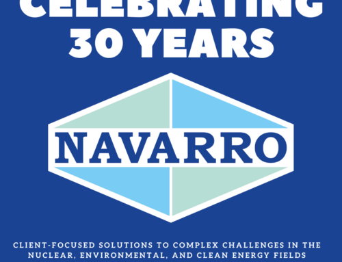
For over 30 years, Navarro has supported our clients and industry partners through our unparalleled commitment to environmental stewardship and our outstanding capabilities, which often allow us to complete projects ahead of schedule and under budget. Now we are looking forward to the next 30 years, and beyond, as we continue to grow and expand our company and its core missions.
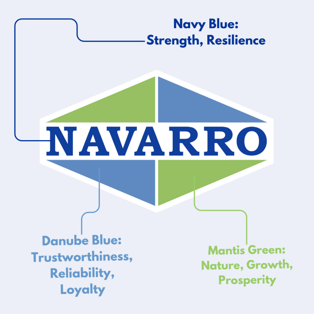
While utilizing the same base as our previous logo, the colors in our new logo represent who we are as a company. For example, Navarro has built a reputation for our trustworthiness, reliability and loyalty to our clients, industry partners and our vast planet. This is demonstrated by the Danube Blue seen in the bottom left and top right corners of the logo.
Keeping our planet in mind, Navarro chose a color that showcases our clean and green missions, supporting our clients and environmental stewardship. The Mantis Green featured in the top left and bottom right of the logo keeps the environment at the forefront of our minds, while also conveying the growth and prosperity we have experienced over the past 30 years.
Unchanged from the previous version, the Navy Navarro at the heart of our logo remains steadfast and bold. Demonstrating strength and resiliency, changing the Navy was never a part of the conversation.
Without purpose and meaning, a logo is just colors on a page. For us, our new logo is much more. It’s a visual representation of where we’ve been and where we are going. It’s Navarro’s answer to the question, “What’s next?” Join us: navarro-inc.com